Settlement Success. Together.
I was engaged by the WEValue team to design the user experience and user interface for a mobile and desktop portal that utilizes Salesforce Experience Cloud and that is scalable for multiple communities, providing resources to service clients with a diverse range of needs. Starting with several discovery meetings with key stakeholders, we developed a plan to conduct a number of user studies with existing WeValue clients to better understand their needs and pain points. My team used a combination of user questionnaires and focus groups to reach a broader range of newcomers with different backgrounds, lengths of time in Canada, and technical skill levels. After numerous meetings to review all the user feedback, the main goals for the portal redesign were decided:
- Clarity of Next Steps
- Accessibility
Clarity of Next Steps:
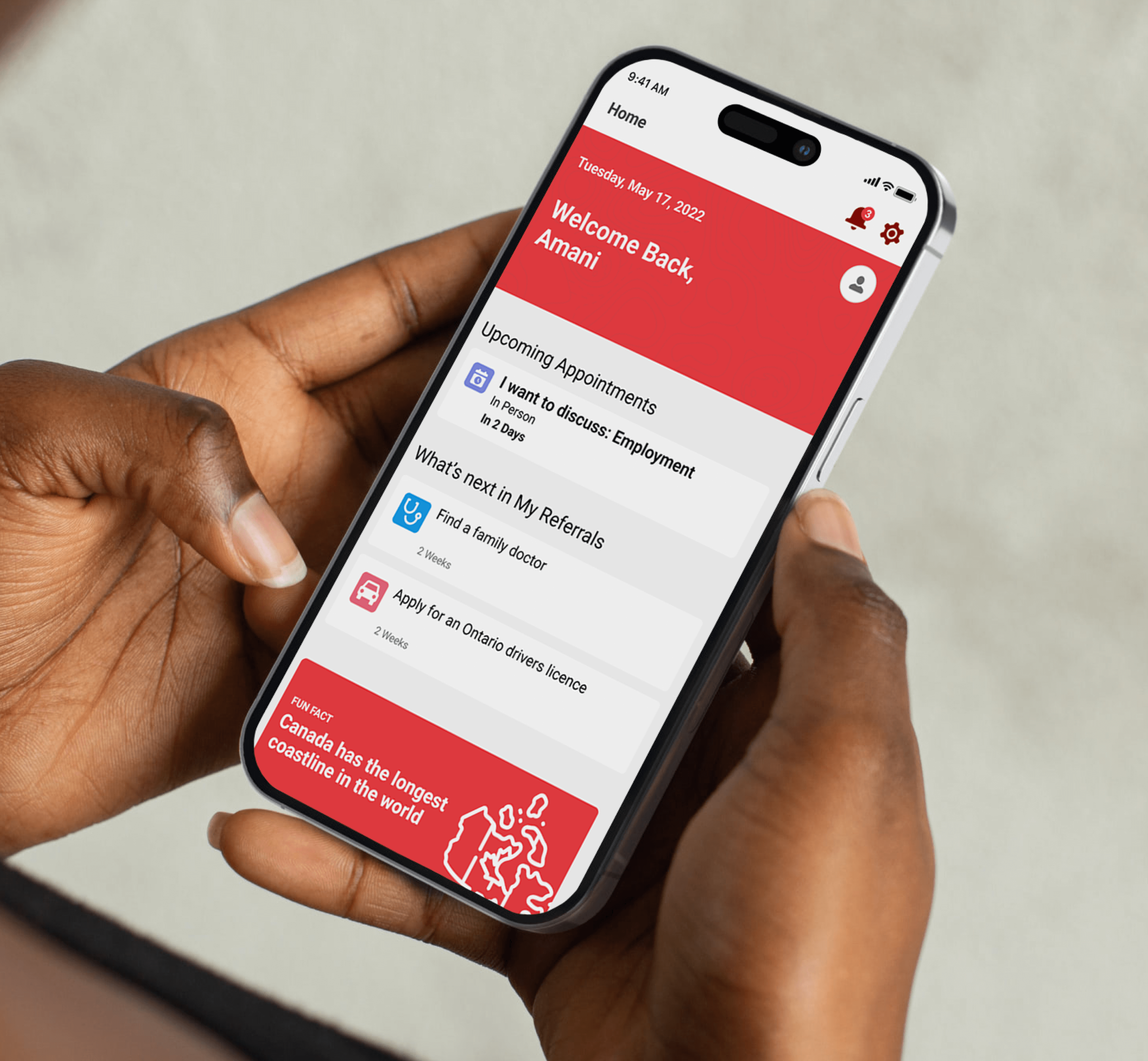
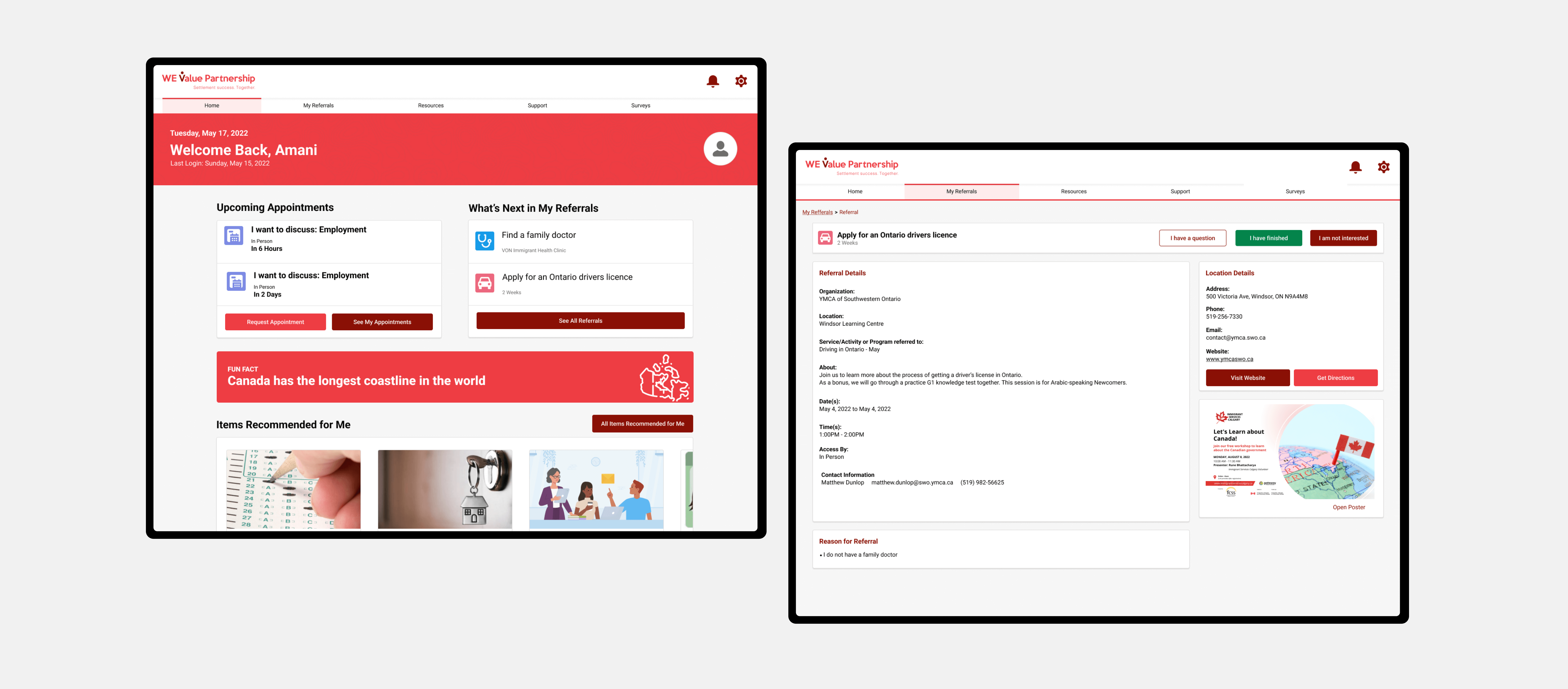
The main focus of the WeValue portal was turning paper service plans that clients receive into a comprehensible, digestible, and actionable digital version. The digital service plan needed to be straightforward and informative, with clear goals and concise steps to help clients achieve successful completion of their plan.
Prioritization of Goals
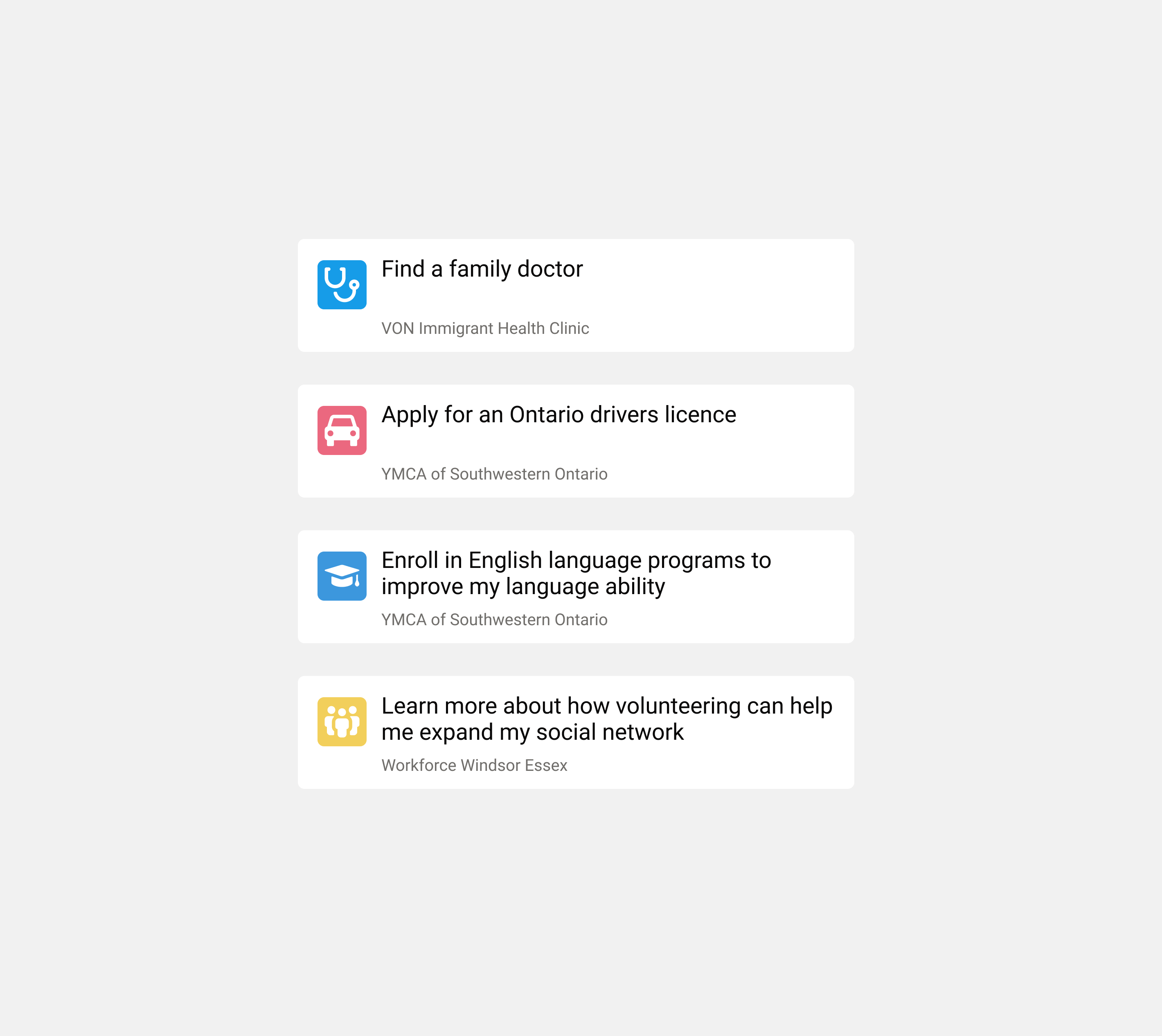
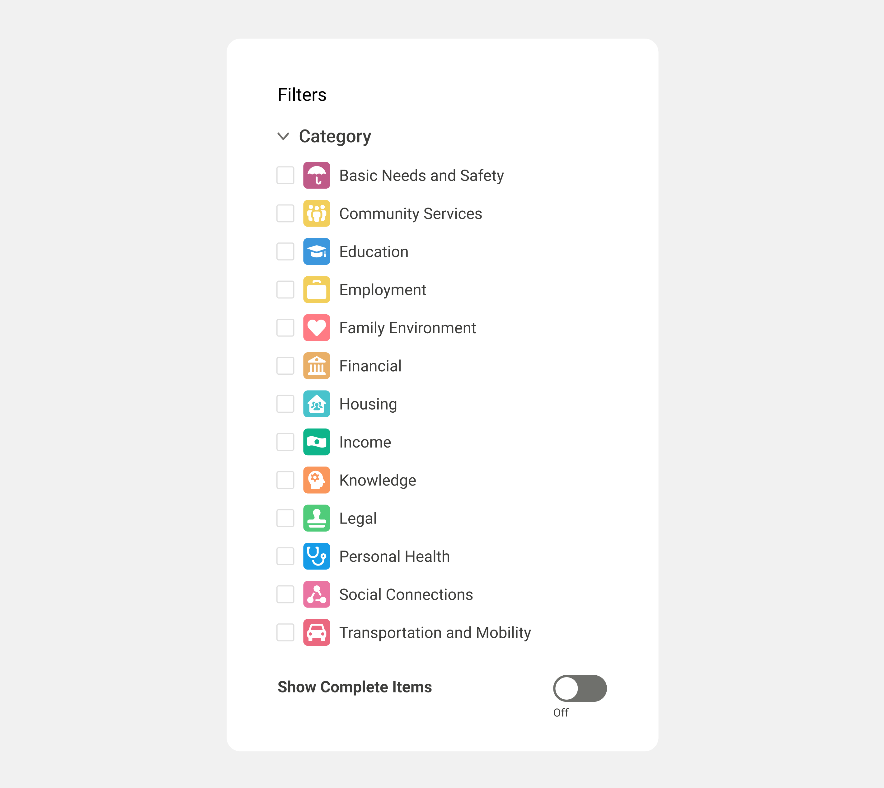
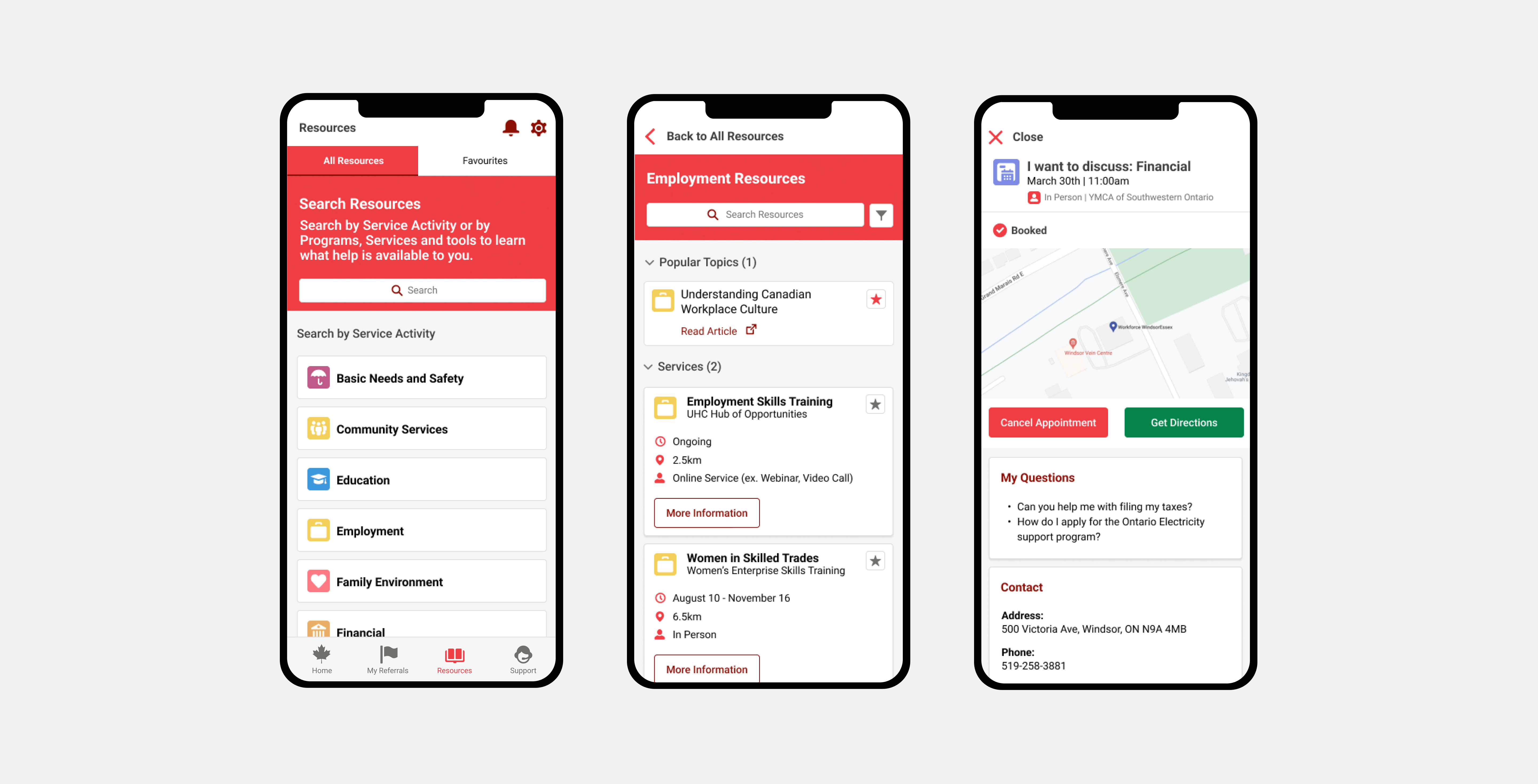
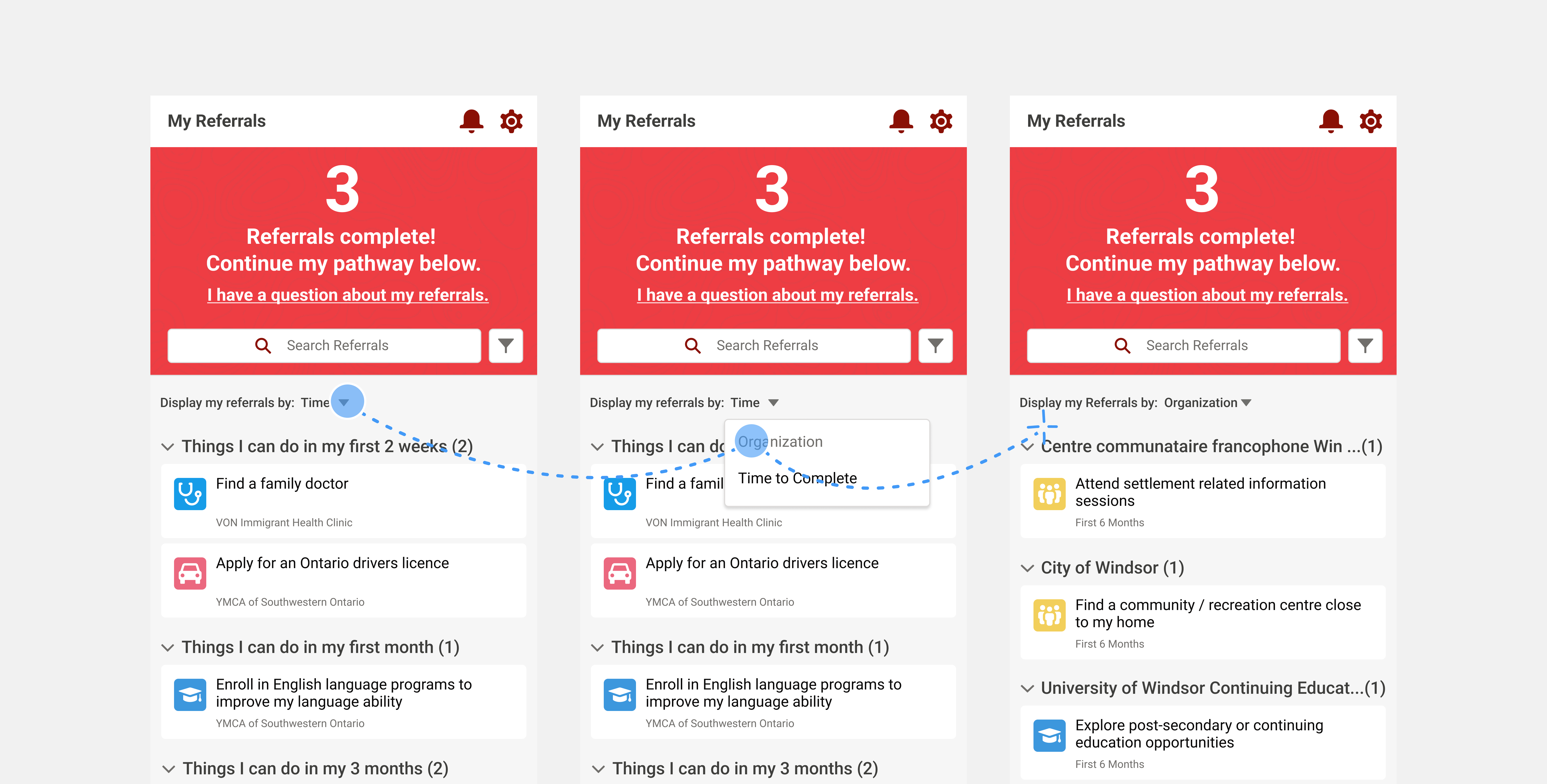
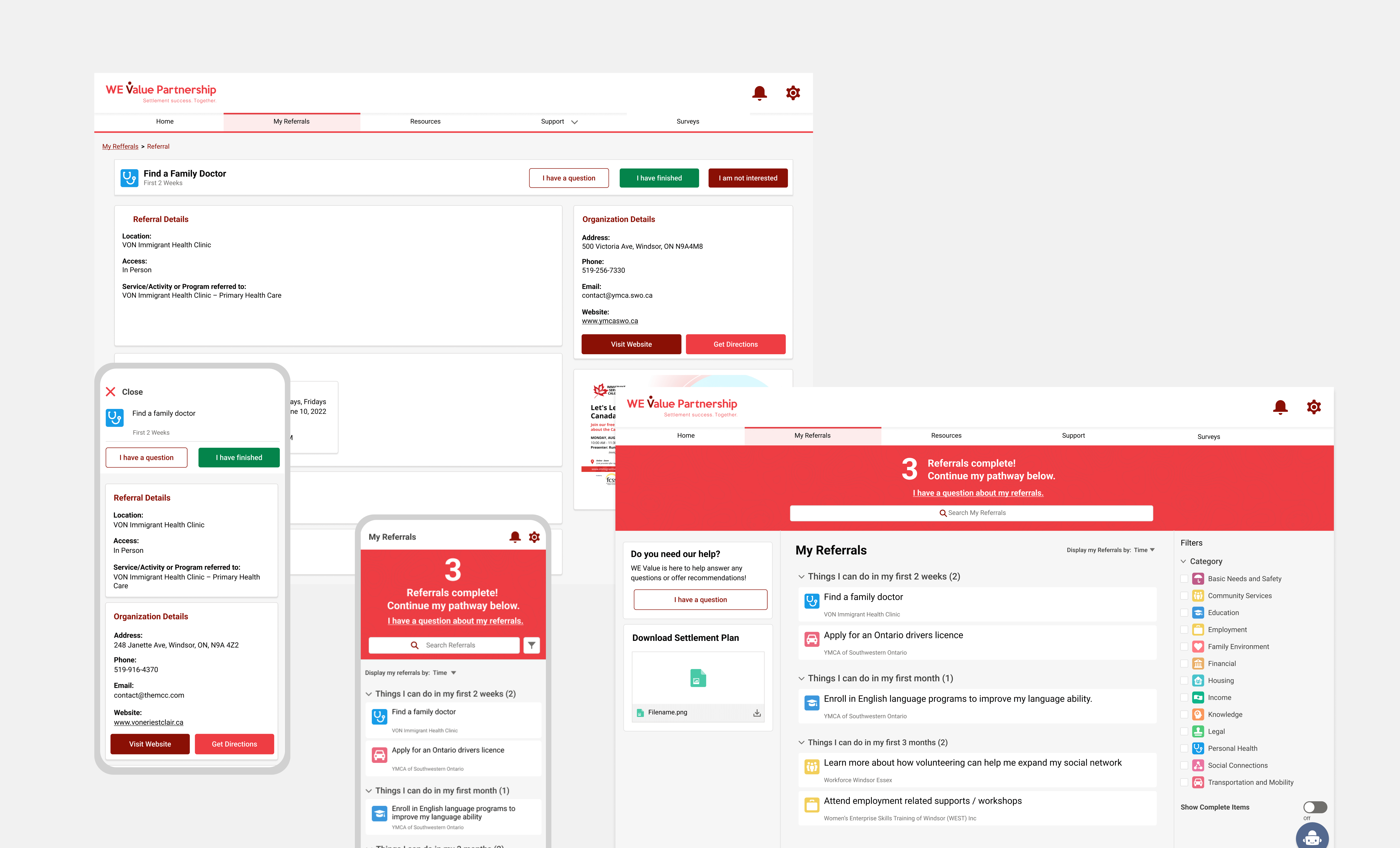
Clients needed a way to manage their plan conveniently and to minimize service fragmentation. The first step was digitizing the service plan that integrated referrals to various organizations and government agencies and presenting it cohesively. Items were presented in a digestible, well-organized list with a number of ways to filter content by topic and user objective.
Filters also provided the ability to organize goals by due date or organization name. Due date allowed users to quickly view time sensitive goals (eg. Obtaining a health card), while organization name would help show goals that were grouped by different service providers. Users could also select which service types they wanted to target. Service categories were assigned unique colour and icons that made them easily recognizable, providing visual consistency throughout the portal.
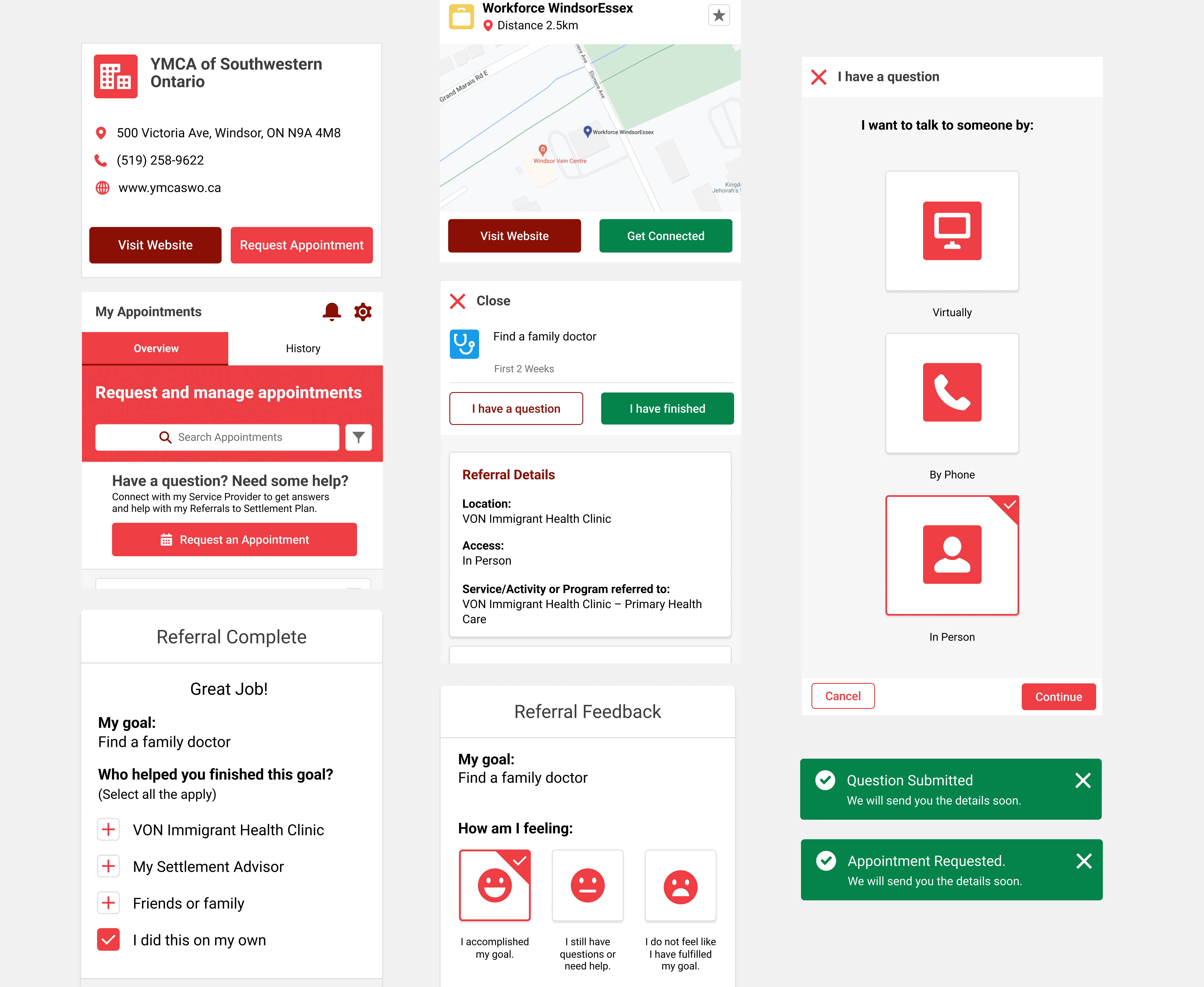
Reliable Helping Hand
An application goal was to reduce friction and support clients appropriately for the challenges that are unique to the needs of each individual newcomer and their families. Throughout the platform, we provided clear CTA (Call-to-Action) elements for users who want to connect to service providers. CTA’s allowed clients to create and discover opportunities, as well as get direct help with any issues that arose as they worked on their service plan.
Providing clear CTAs helped to ensure the portal was intuitive and supportive to all clients, and able to lead them to the desired outcome of successful service plan completion.
Accessibility
Ensuring accessibility of the platform came with its own set of unique constraints and challenges. Some new immigrants may have limited access to technology or may not be familiar with navigating online platforms. Designing the portal to be accessible and user-friendly, for various ages and levels of digital literacy, was important. A mobile first approach was necessary as many users would be accessing their service plans via mobile device. Utilizing existing Salesforce components ensured that implementation of the platform experience was consistent across potential devices and access points.
Despite the challenges of working within an existing system, developing flexible UX patterns that could be applied to different forms of content and user objectives would ensure the platform could scale appropriately as services and resources were expanded and integrated.
Result
Not only was the initial release of the portal well received by clients, feedback provided from key stakeholders expressed that they were thrilled with the creation of the high-fidelity mockups and prototype.This became the only official prototype of its kind, establishing best practices across departments, reducing complexity for developers, and spurring a digital transformation of future projects.
Key Takeaways from this project:
Users' abilities can vary immensely. Working with the product team and users to make sure that designs were grounded in users’ reality and followed the specific capabilities of people relying on the system for successful outcomes.
Don’t focus on the details. Using a design framework (Salesforce) helped us to take a step back to reassess user flows and reprioritize the user experience.